
Ryse Bakery
UX DESIGN
BRANDING
Overview
During the Google UX Design course offered through Coursera, I was challenged to design a comprehensive mobile app and brand identity for a local business. This project involved conducting user research, creating wireframes and prototypes, and iterating based on feedback to develop an intuitive and engaging user experience. In addition to the app’s functionality, I crafted a cohesive visual identity that aligned with the business’s values, ensuring consistency across digital and physical touchpoints.
Project Objectives and Goals
The objectives and goals from this project are as follows:
Define target audience
Create branding and identity
Mobile app mockups and user flow
Defining Target Audience
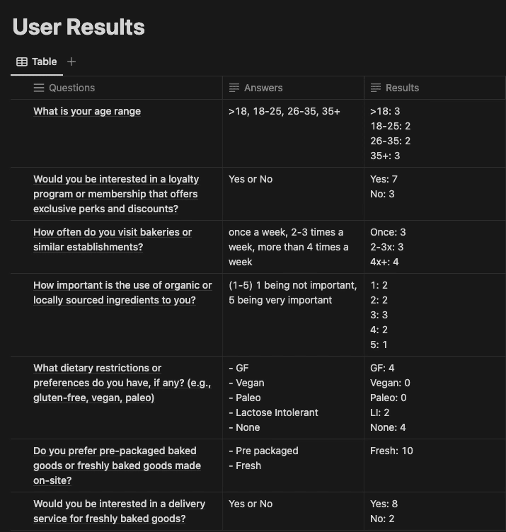
To effectively define the target audience, I conducted a user survey aimed at identifying key user personas. I carefully selected a set of targeted questions designed to uncover valuable insights into users' needs, preferences, and behaviors. The survey results provided a clear understanding of the audience, helping shape design decisions that address their specific pain points and motivations.
Displayed below is a table outlining the survey questions and corresponding results, offering a data-driven foundation for the project’s user-centered design approach.
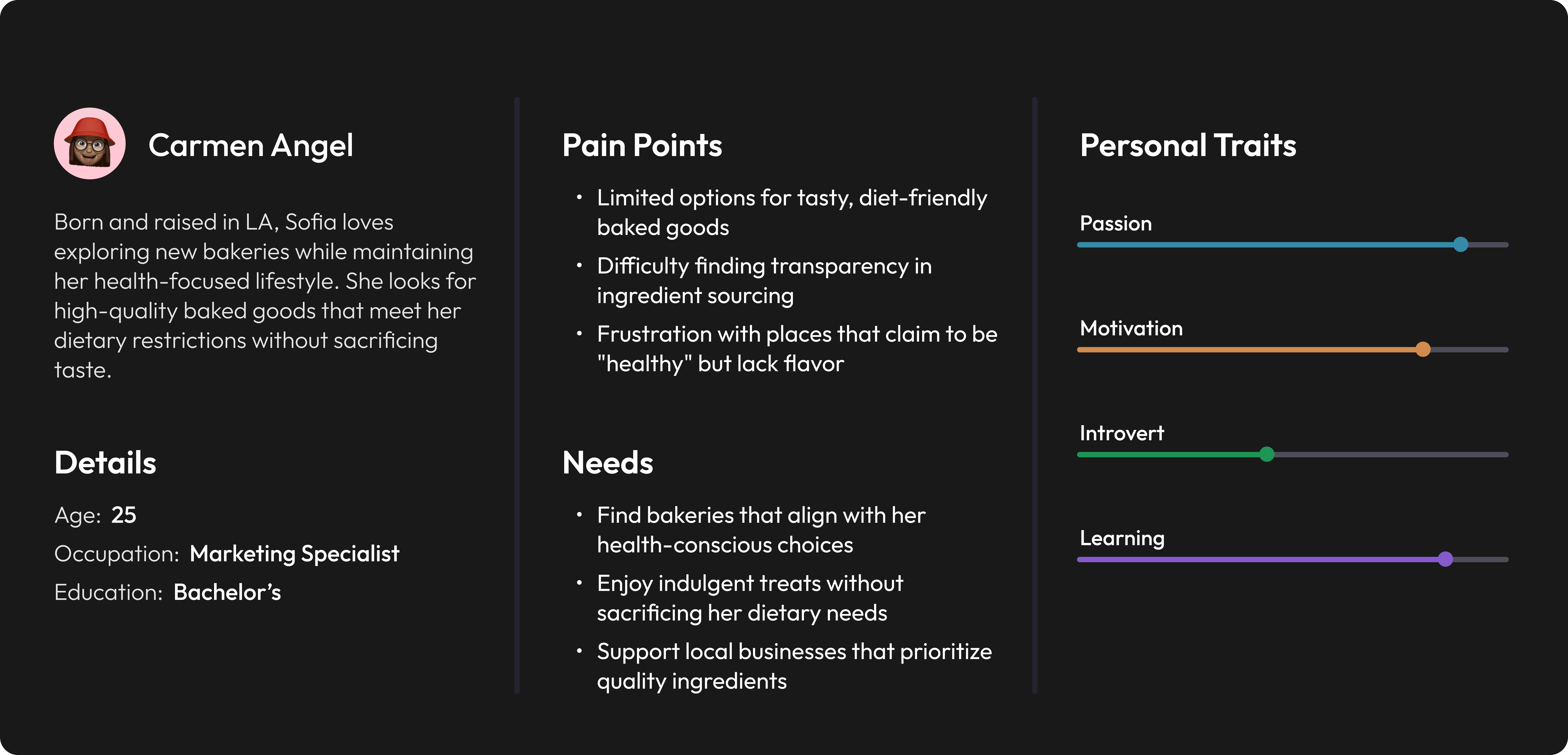
Based on the survey findings, I was able to produce two personas that would help me in the design and development of the mobile app.

Starting the Designs
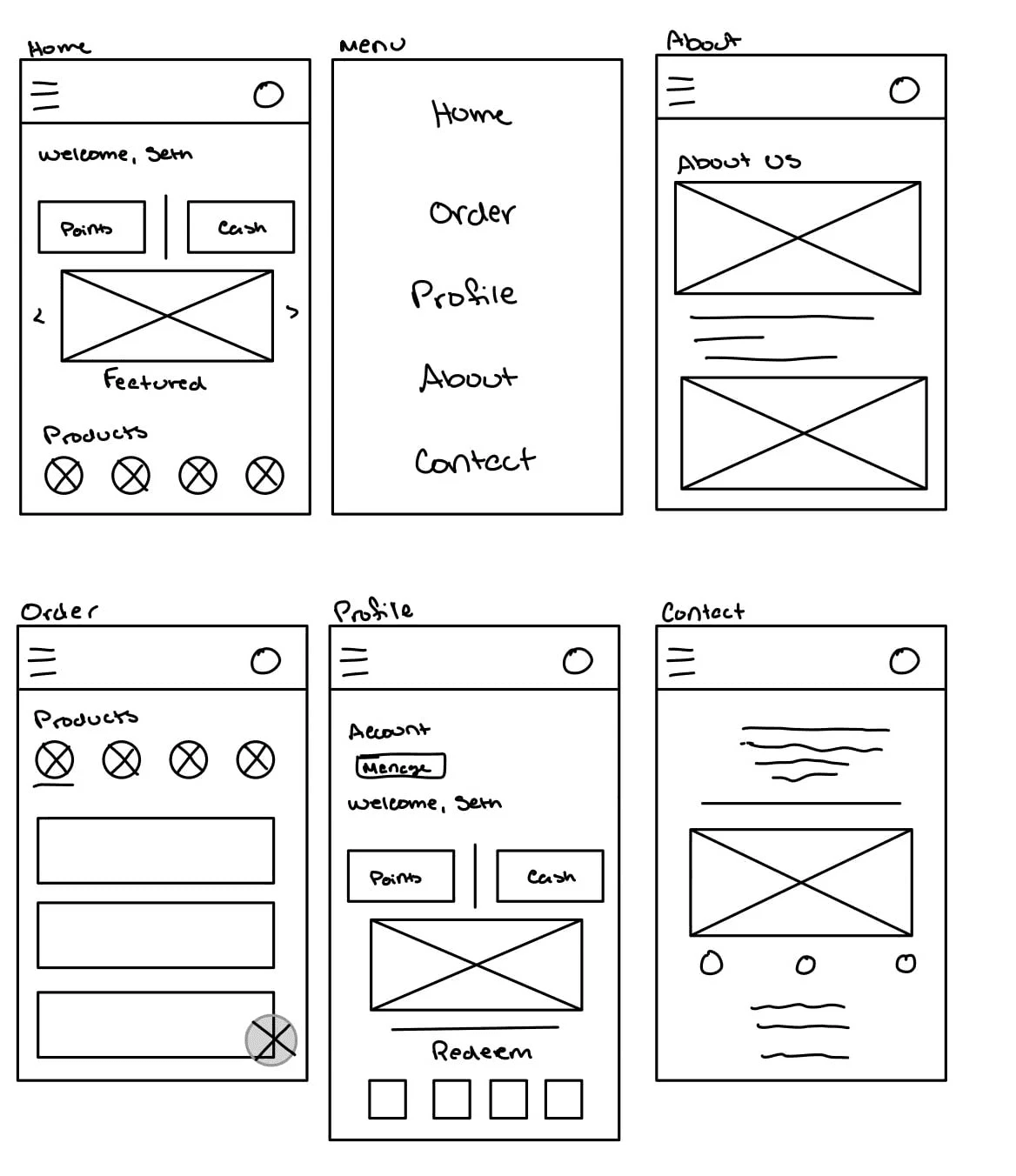
Building off of the user personas and survey findings, I began the paper wireframing process. I started with 6 screens that detailed the different sections that needed to be included in a mobile app.
Home
Menu Bar
Order
Profile
About
Contact
Brand Identity
Creating a cohesive mobile design begins with strictly adhering to the brand standards outlined in the branding guide. A well-defined color palette and thoughtfully selected typography are essential in reflecting the brand’s identity and tone. By establishing an engaging visual language, the design not only enhances the product’s appeal but also strengthens its connection with the target audience, ensuring consistency and long-term success.

The other branding items that I developed for this project included business cards as well as a storefront sign.


Digital Wireframes
These paper wireframes were then converted into digital, with some minimal changes made to account for screen layout.

These digital wireframes and initial order flow was then used in a usability study to determine the difficulties the target user would encounter during a session. The testing session took 5 participants through a set of objectives to determine how easy or difficult the app was to use and what changes needed to be made. The objectives were as follows:
Add an item to cart
Locate the contact options
Manage your account details
These objectives led to insights that were helpful in the iterations and high fidelity wireframes. The insights gathered included:
Navigation is clunky
Cart button is impeding on the screen
Based on these findings, the high fidelity wireframes contains changes that clean up the navigation and move the cart button to a more appropriate location, as well as some general styling changes.
Solution
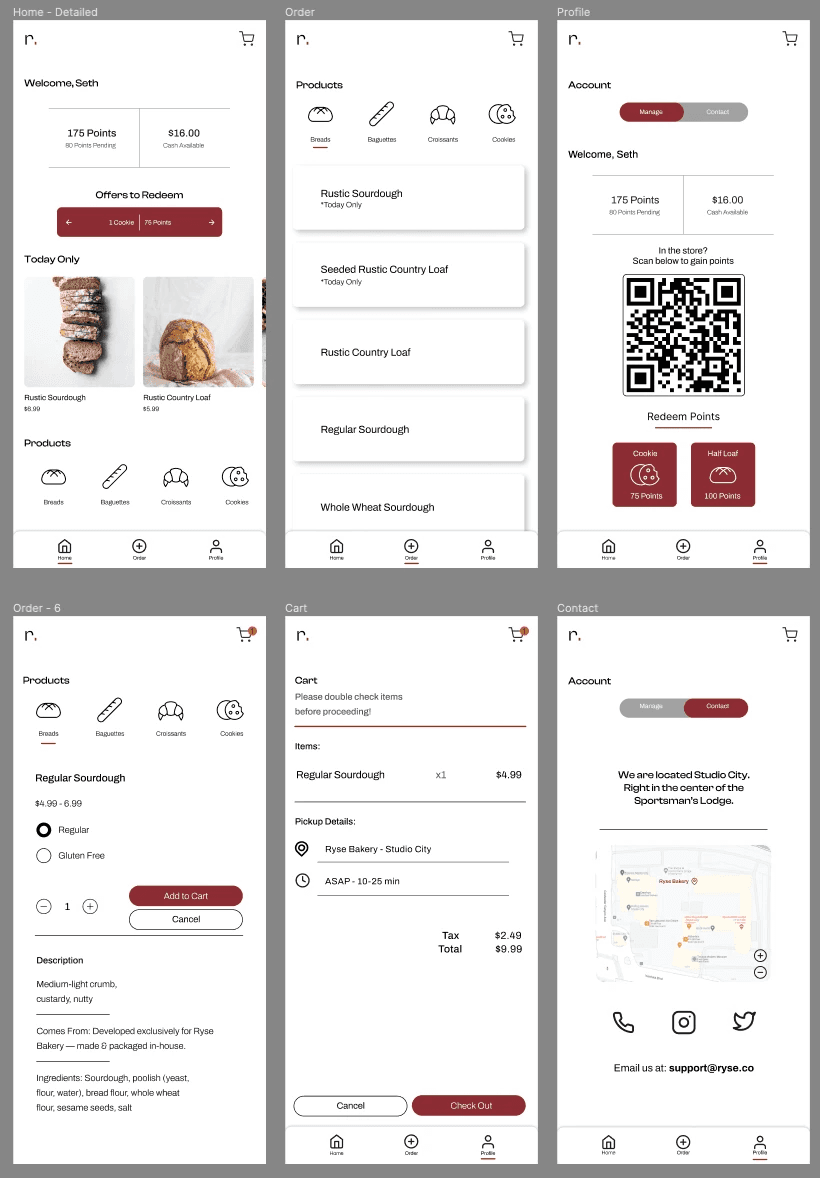
The high fidelity mockups provide the viewer with an accurate representation of the near final form of the mobile app, should it be put into development.
Closing
The takeaways I had while designing the app were that I learned that the first ideas for the app are only the beginning of the process. Usability studies and peer feedback influenced each iteration of the app’s designs. The impact of my designs has been significant, with users reporting an improved user experience and increased engagement. One study participant commented,
The new design is much more intuitive and visually appealing, it has completely transformed my experience with the product.
As for next steps and moving forward, I will take these experiences and lessons further into my product design journey and apply them in each new project I take on.